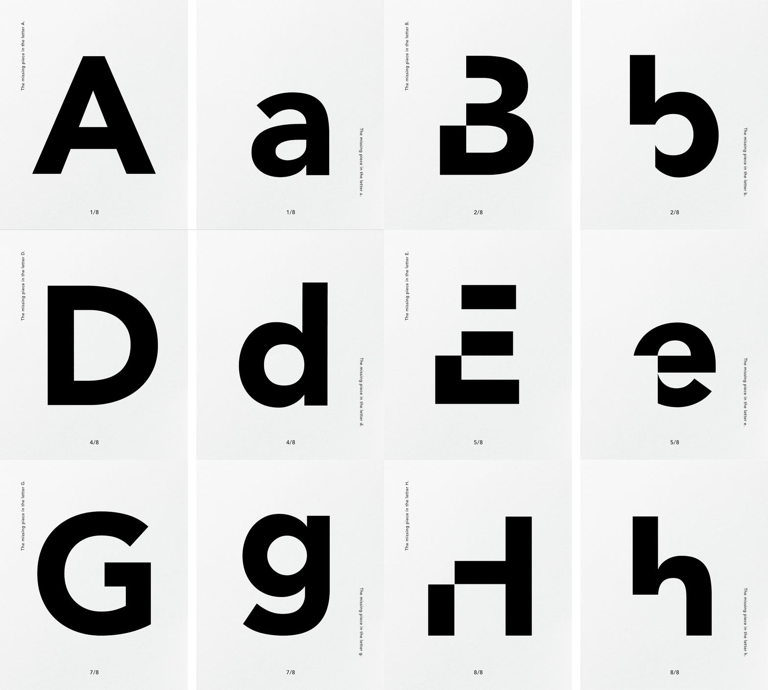
A Missing Piece
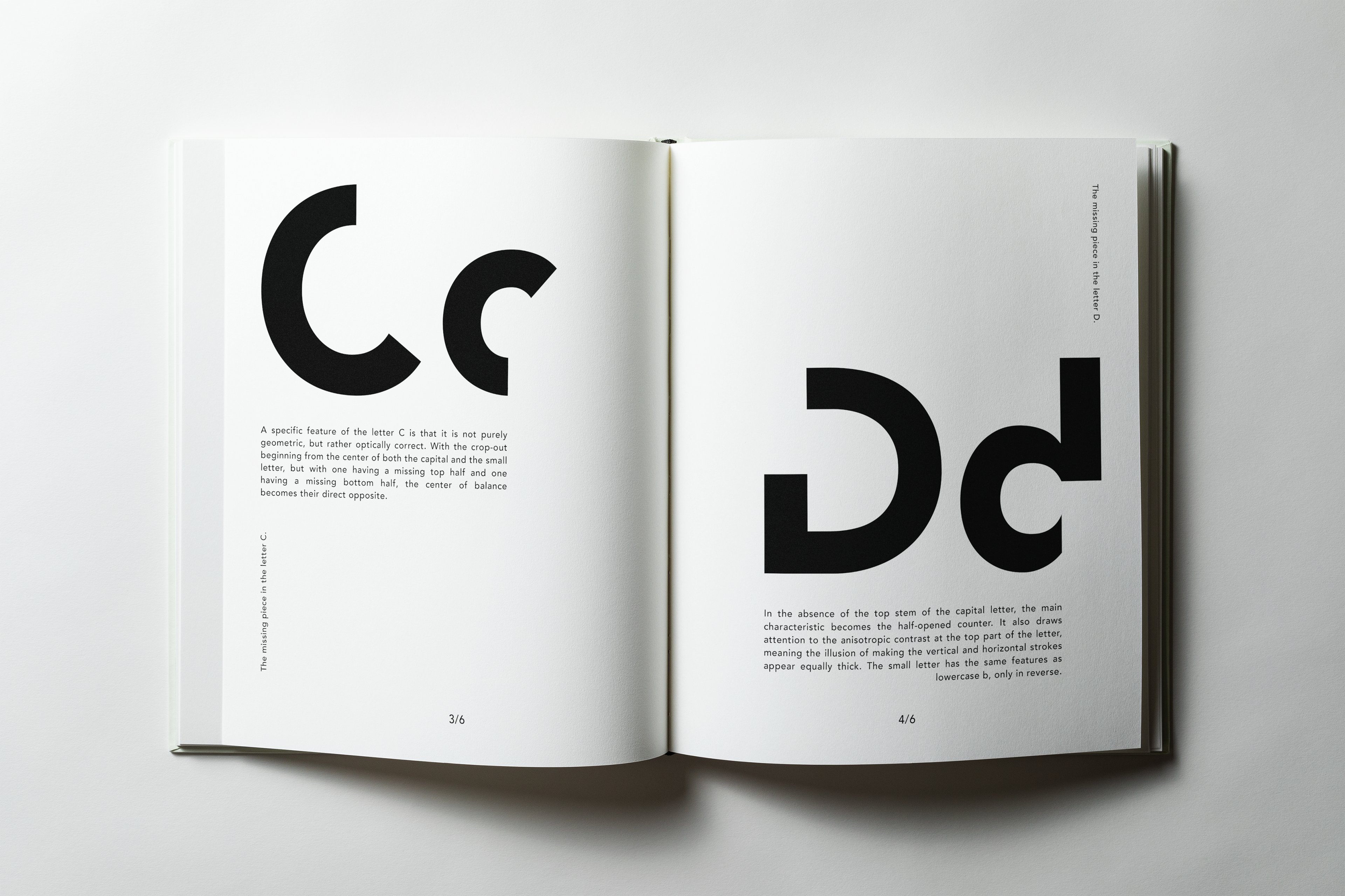
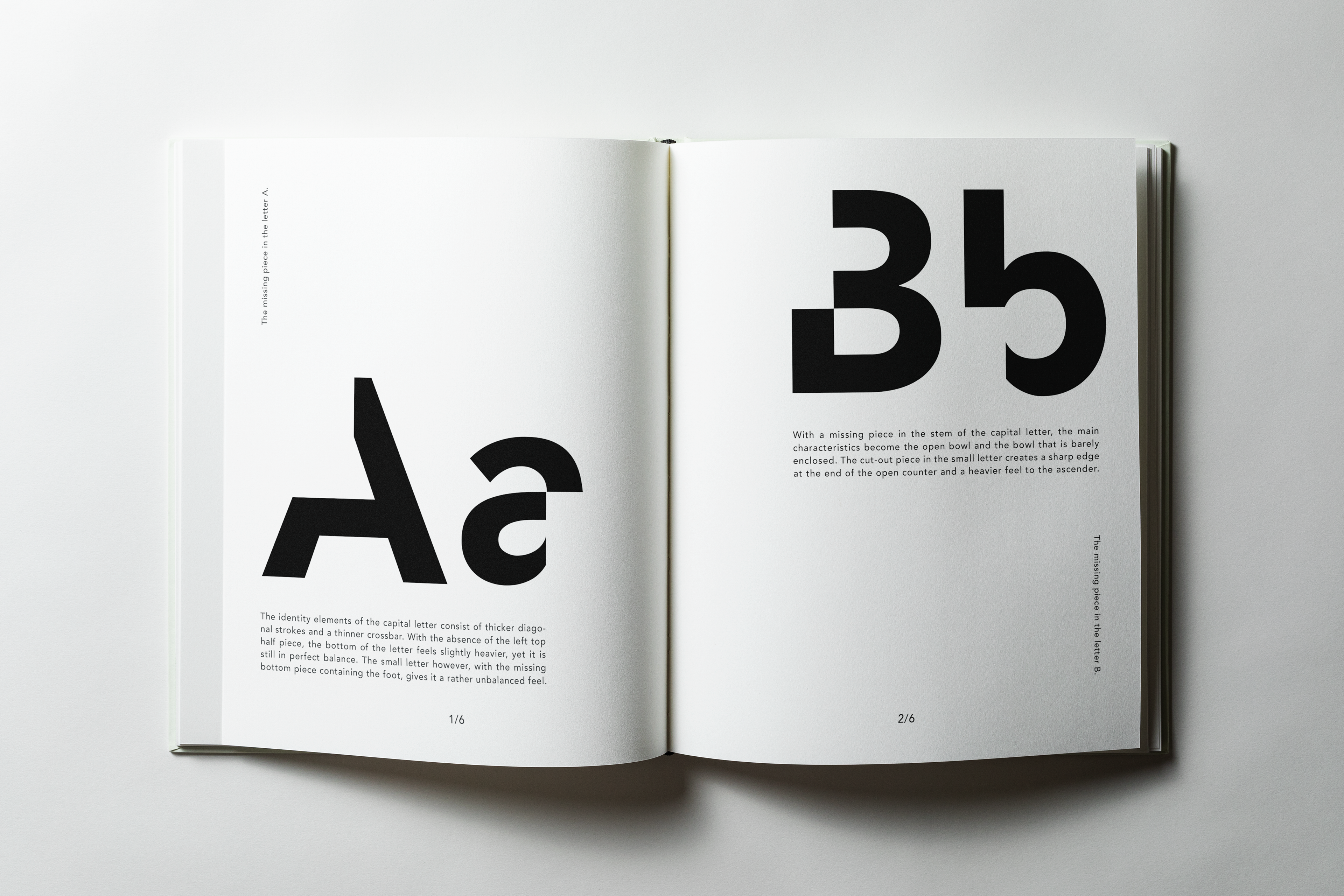
This typography book was created as part of my 2020 design school application, where the brief was to design an editorial publication using typography alone. The project could not include illustrations, and each letter was paired with a short piece of text. Although it was one of my first graphic design projects, it remains one of my favorites.
Inspired by minimalism, I reimagined Avenir by removing what felt non-essential while keeping each letter recognizable. To create a consistent visual system, the uppercase letters have a section removed from the top, while the lowercase letters have the same intervention applied to the bottom.
The result is a conceptual editorial project that explores reduction, recognizability, and the expressive potential of typography.
– Art Direction, Graphic Design, Editorial Design